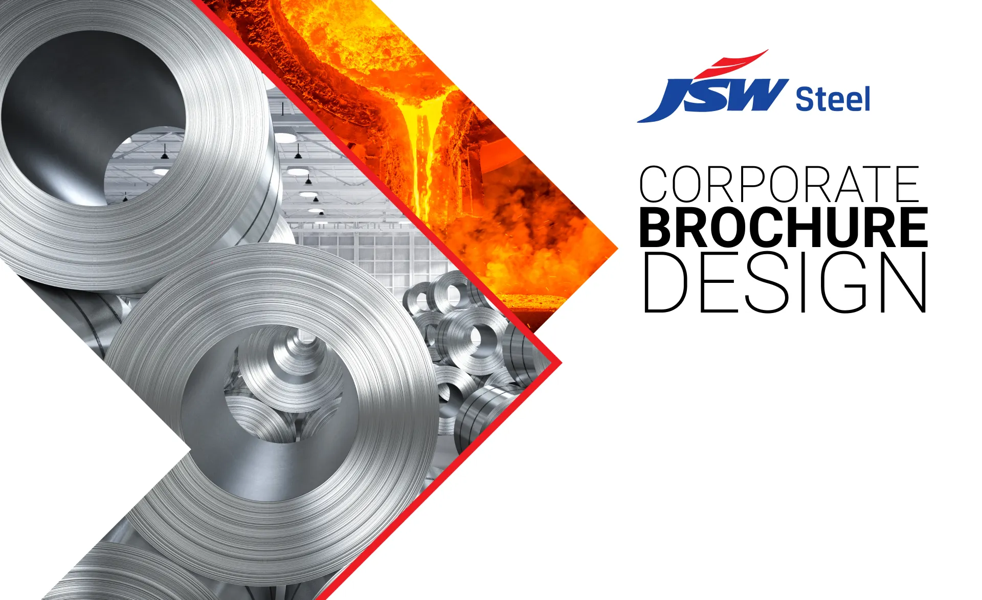
Client: JSW Steel
Industry: Steel Manufacturing
Nature of the Project: Corporate Brochure Design
Deliverables: Brochure
Website: www.jsw.in
Services Provided: DigiBrandX
Project Duration: 3 Weeks
Team Members: 3 Persons
Creative Director: Kishore Pratim Biswas
Tools Used: Adobe Illustrator, InDesign, Photoshop
At our creative agency, we designed a powerful, visually striking brochure for JSW Steel, one of India’s leading steel-making brands. Combining bold industrial aesthetics with clean, modern layouts, the brochure showcases JSW Steel’s innovation, sustainability, and manufacturing excellence. From high-quality product visuals to clear, data-driven infographics, every element is crafted to reflect the brand’s strength and forward-thinking approach. Tailored for investors, clients, and stakeholders, the design enhances brand credibility and impact. With strategic content placement and premium design, this brochure positions JSW Steel as a global leader in the steel industry.
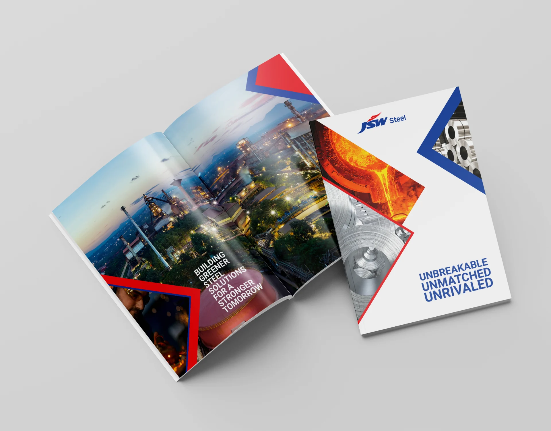
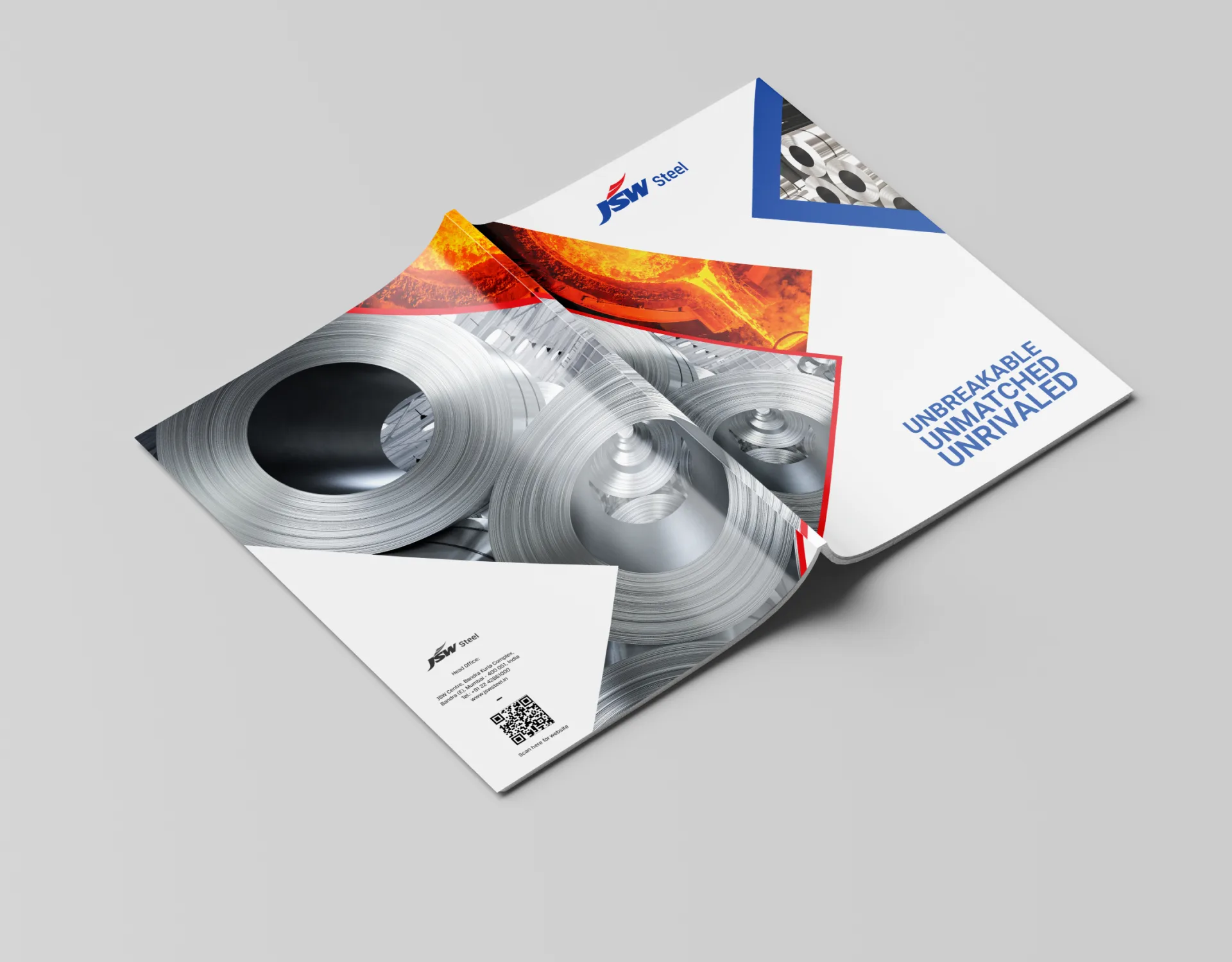
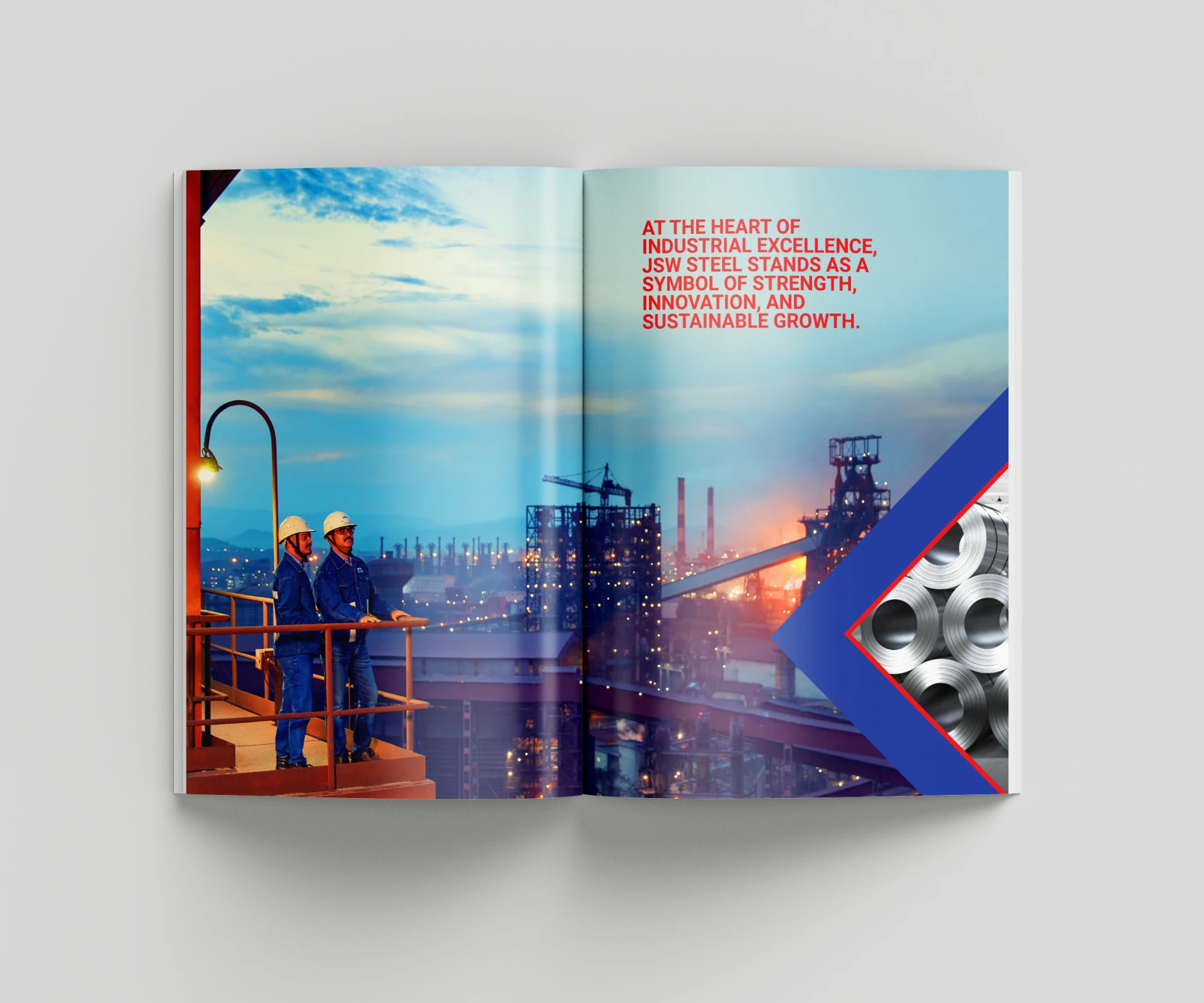
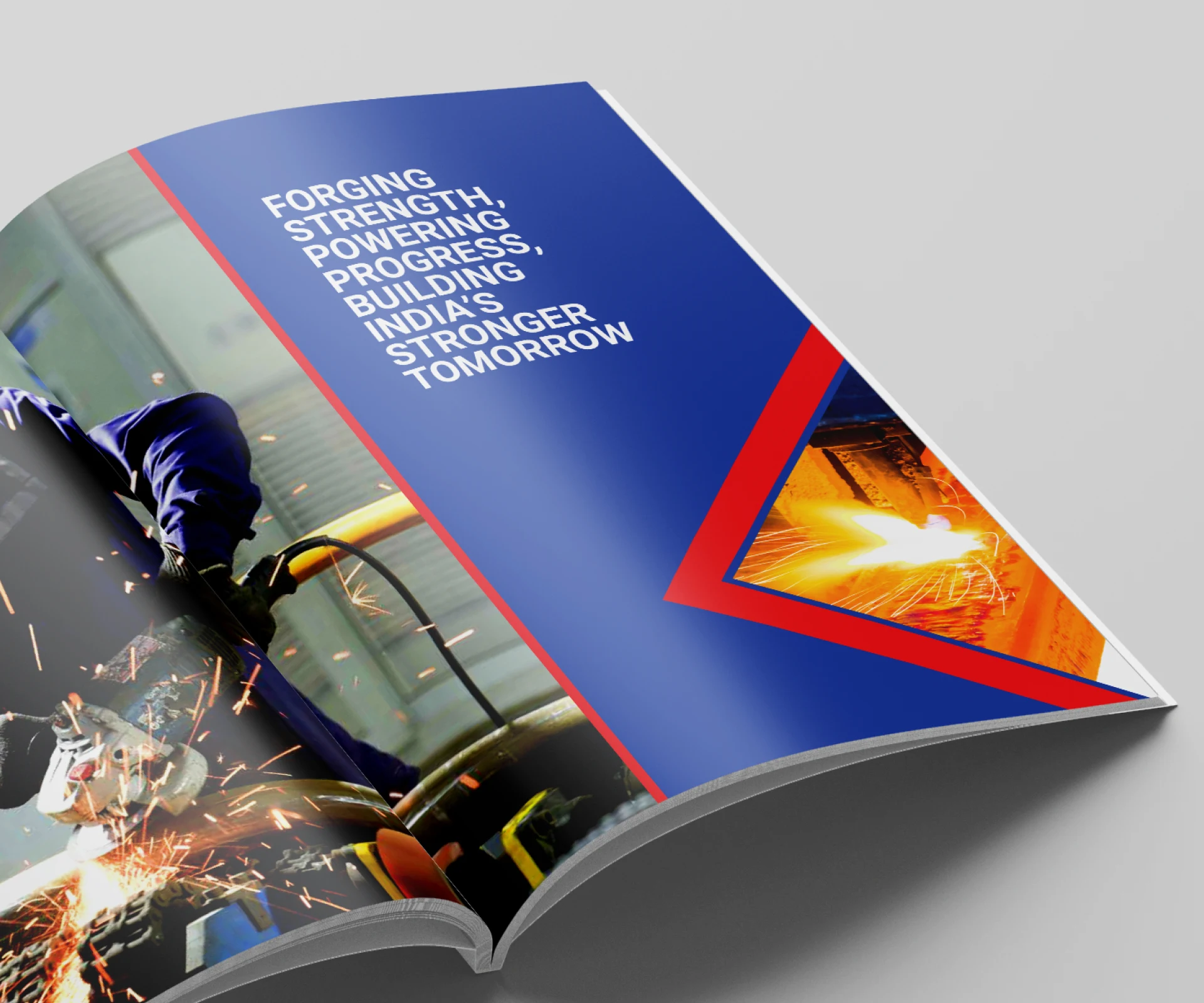
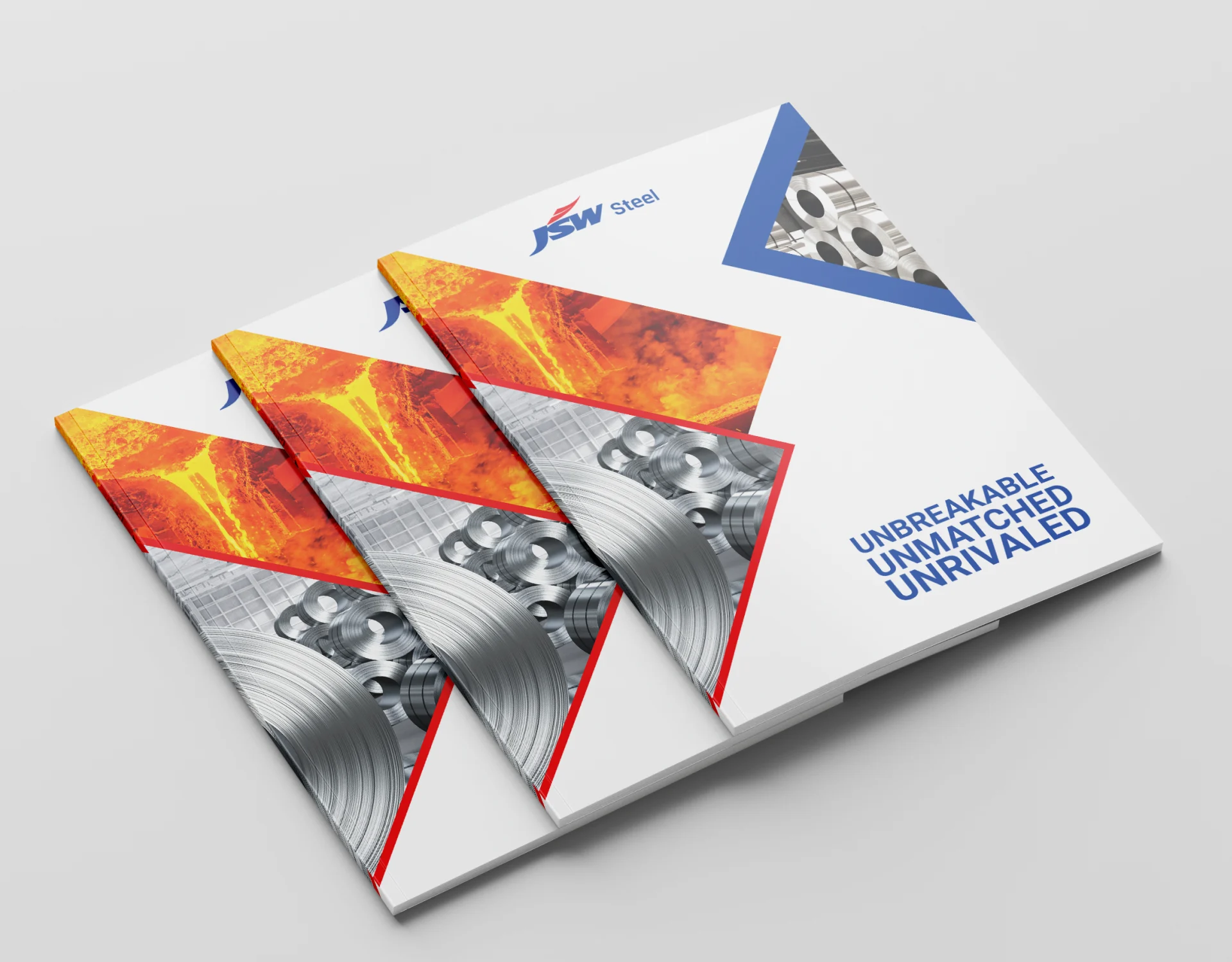
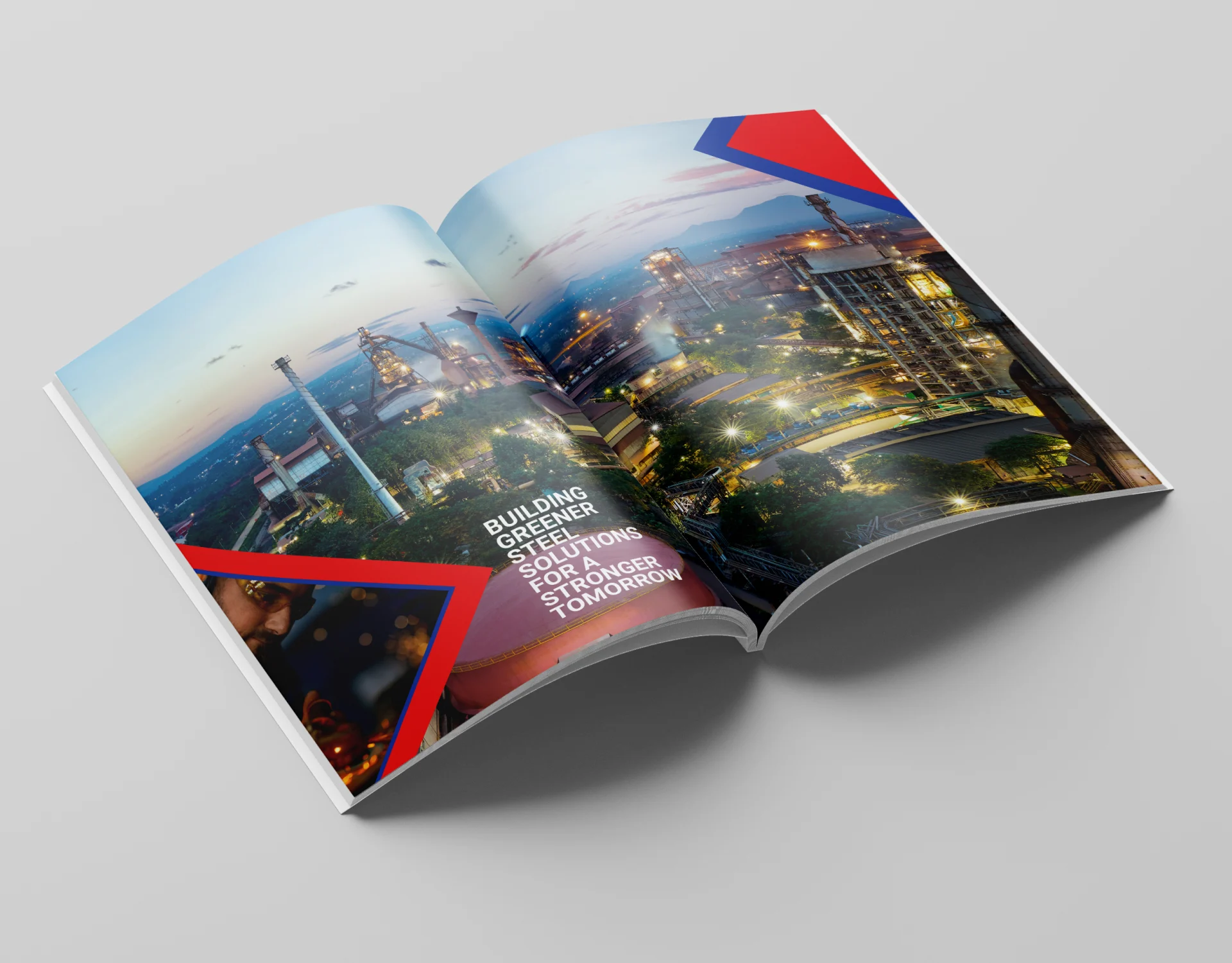
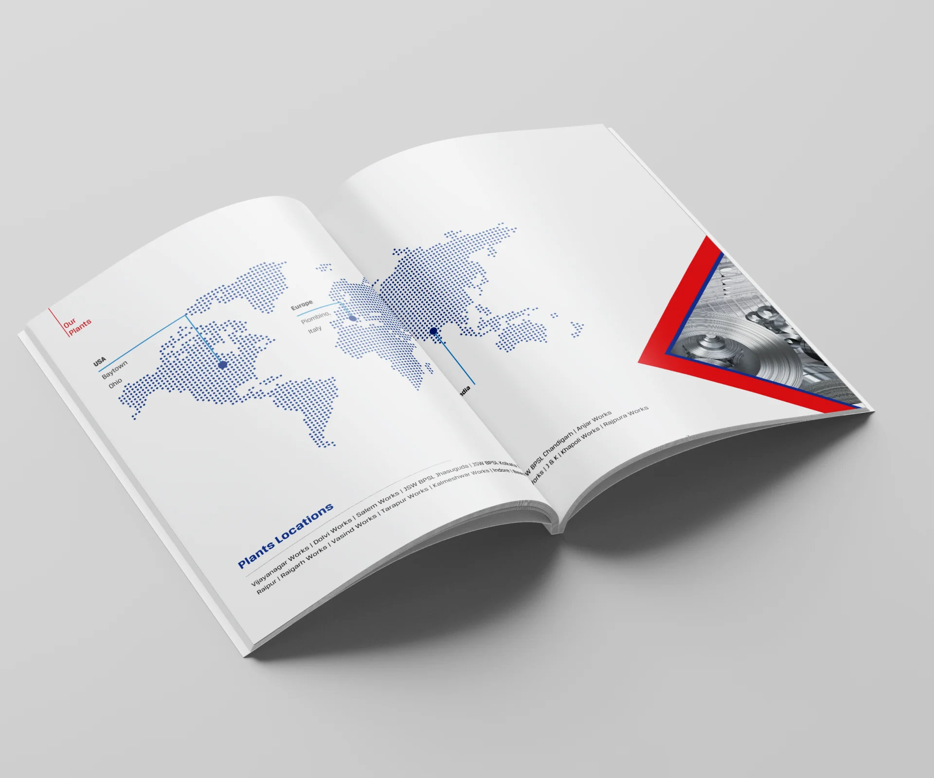
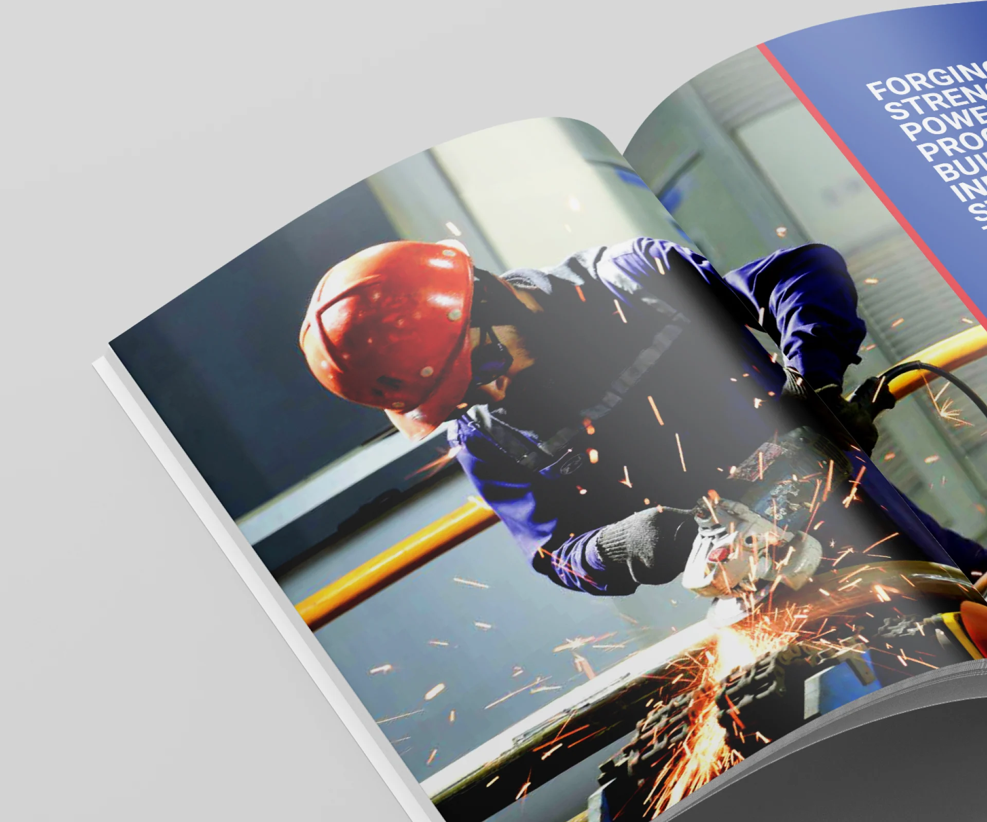
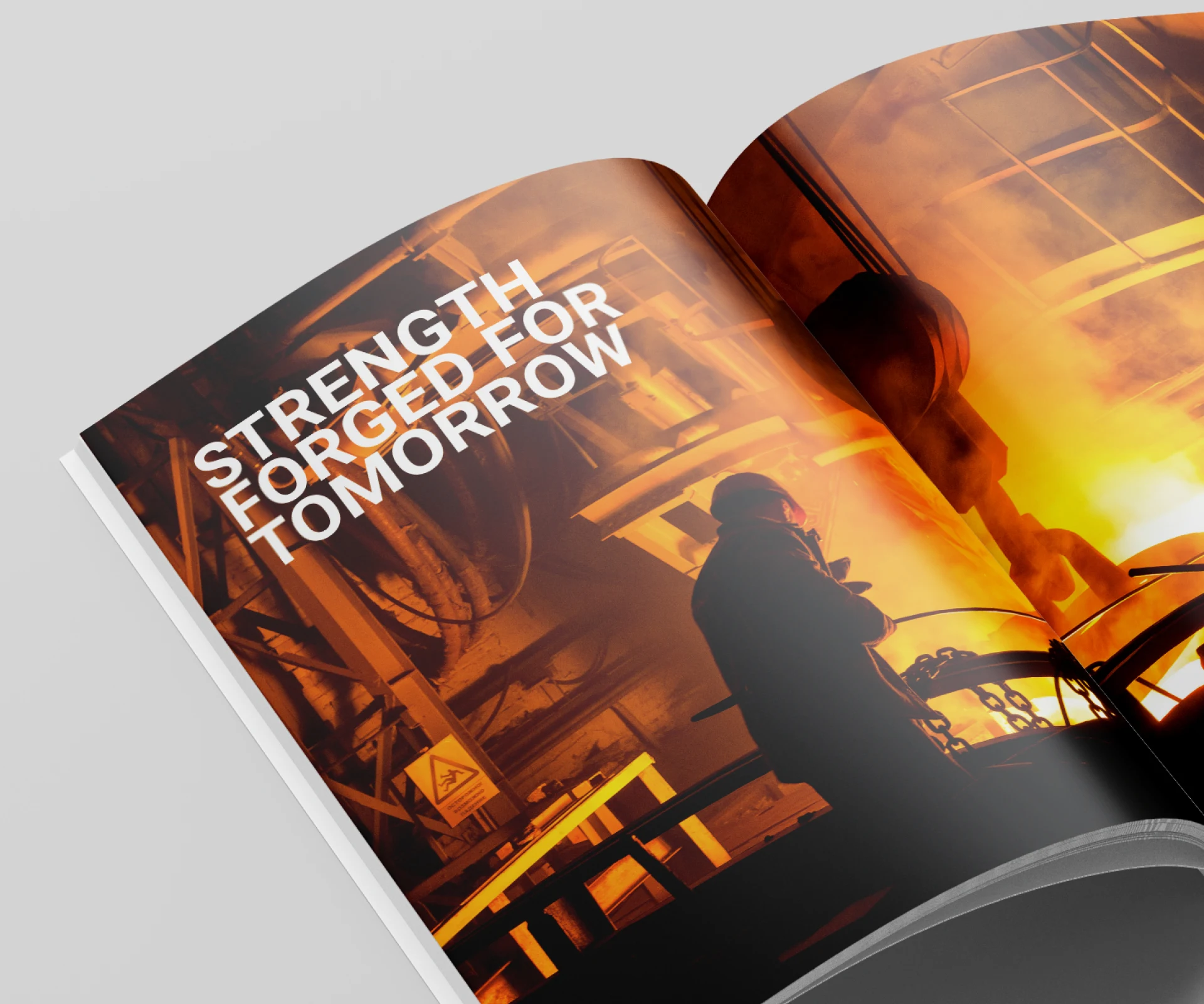
Creating an effective steel company brochure design requires more than arranging corporate information and manufacturing images across pages. For JSW Steel, our starting point was understanding the business behind the communication—the steel-making environment, manufacturing capabilities, corporate priorities, product strengths, infrastructure, and the broader story the brand needed to communicate.
This understanding helped us determine how technical, corporate, and brand information should work together within a single communication piece. Rather than presenting large volumes of information with equal emphasis, we developed a structured content hierarchy that guided readers through the company's story.
The resulting steel manufacturing brochure design combines industrial imagery, organized information, corporate messaging, and visual storytelling to communicate scale and capability with clarity. Every section was considered as part of a connected narrative, helping the brochure reflect the strength and business perspective of an established steel manufacturer.
Our approach to industrial corporate brochure design for JSW Steel focused on translating complex business and manufacturing information into clear, structured, and visually engaging communication.
The content hierarchy was shaped around the client's communication priorities, allowing manufacturing capabilities, product information, infrastructure, industry expertise, and corporate vision to be presented within a consistent editorial system.
Typography, industrial imagery, page composition, spacing, and graphic elements were developed to create a confident visual language while maintaining readability across information-rich sections. The objective was not simply to make individual pages attractive, but to establish continuity throughout the brochure.
By treating the brochure as a strategic corporate communication asset rather than a collection of independent layouts, the design helped communicate JSW Steel's scale, capabilities, and established presence within the steel manufacturing industry.
Industrial businesses often need to communicate substantial amounts of information to different audiences. Manufacturing processes, products, infrastructure, technical capabilities, corporate values, and business information can quickly make a brochure difficult to navigate if the content lacks hierarchy.
For the JSW Steel project, information architecture became an important part of the design process. Related content was grouped logically, key messages were given appropriate prominence, and supporting information was structured to make each section easier to understand.
This approach helped establish a natural reading flow across the brochure. Headlines, body copy, imagery, graphic elements, and supporting information worked together instead of competing for attention.
For a B2B corporate brochure, this balance is particularly important. Strong information design helps decision-makers and stakeholders identify relevant information while still experiencing a consistent corporate narrative.
Steel manufacturing communicates ideas of strength, engineering, scale, precision, infrastructure, and progress. The visual direction needed to express these qualities without relying on decorative industrial imagery alone.
The brochure therefore used industrial visuals as part of the communication system. Manufacturing environments, processes, infrastructure, products, and relevant corporate imagery helped establish context while supporting the written narrative.
Composition and image selection were considered in relation to each section's purpose. Large visuals could communicate scale, while more structured page layouts supported detailed corporate and technical information.
This combination created an industrial brochure design that remained closely connected to the character of the business while providing a contemporary corporate presentation.
A successful corporate brochure needs to guide the reader through information without making the structure feel complicated. For JSW Steel, the editorial approach established clear relationships between major messages, supporting content, imagery, and detailed information.
Consistent heading levels, page structures, typography, spacing, and visual cues helped create continuity from one section to another. This system allowed information-heavy pages to remain organized while giving important messages sufficient visual prominence.
The layout was designed to balance communication and presentation rather than allowing one to dominate the other. This was particularly relevant for a steel manufacturing brochure, where technical credibility and corporate storytelling need to coexist.
The resulting editorial system helped turn complex material into a more coherent reading experience while maintaining the professional character expected from a major industrial brand.
Typography plays an important role in establishing hierarchy within information-rich corporate communication. The brochure required a typographic system capable of differentiating major statements, section headings, supporting messages, and detailed copy while maintaining consistency throughout the document.
A disciplined layout structure provided the foundation for this system. Grids, alignment, spacing, image proportions, and text placement were used consistently to create visual rhythm across the brochure.
Brand consistency was equally important. As part of effective corporate branding, the brochure needed to maintain a recognizable visual character across every section rather than allowing individual spreads to become separate design exercises.
This approach helped ensure that the brochure maintained a recognizable corporate character from beginning to end, strengthening the relationship between content, visual identity, and JSW Steel's overall brand presence.
For an industrial organization, a corporate brochure often communicates with multiple stakeholder groups. The design therefore needs to balance business information, technical credibility, brand values, and visual engagement.
Our approach to B2B brochure design for a steel company used visual storytelling to make this information more accessible. Photography, typography, content sequencing, page composition, and supporting graphic elements were coordinated to help readers understand both the scale of the organization and the details behind its capabilities.
Instead of treating design as decoration around corporate content, the visual system became part of how the information was communicated.
This is particularly important in industrial communication, where design can help translate complex subjects into a format that feels structured, credible, and easier to navigate.
The completed JSW Steel brochure brought corporate information, manufacturing capabilities, industrial imagery, and visual identity together within a unified editorial framework.
The structured hierarchy helped organize complex information, while the visual system established consistency across different types of content. Industrial imagery communicated the scale and character of the business, while typography and disciplined layouts supported clarity and readability.
The result was more than a presentation of products and facilities. It became a cohesive corporate communication piece designed to express the company's capabilities, scale, and position within the steel manufacturing sector.
For DigiBrandX, the project demonstrates how industrial corporate brochure design can combine strategic information architecture, editorial thinking, and visual storytelling to communicate a complex manufacturing business with clarity and purpose.
Projects such as JSW Steel demonstrate the importance of combining business understanding with information design and creative execution. DigiBrandX develops corporate communication that transforms complex business information into structured, visually consistent brand narratives.
Explore our corporate brochure design services to learn more about our approach to brochure strategy, information architecture, editorial design, and visual communication for B2B and corporate brands.
Before developing a corporate communication piece, businesses should understand the difference between a corporate brochure vs company profile to determine the right format for their audience, communication objectives, and content requirements. Once the format and scope are defined, evaluating the brochure design cost can help plan the number of pages, content development, design complexity, imagery, infographics, print specifications, and production requirements. Considering these factors early helps create a more structured brochure brief while aligning communication priorities, creative execution, and project investment. The JSW Steel project demonstrates DigiBrandX’s capabilities as a creative agency, integrating strategic thinking, industrial visual communication, editorial design, typography, and brand storytelling to transform complex B2B information into a clear, consistent, and engaging corporate communication experience.
Our corporate brochure portfolio spans multiple B2B and industry sectors, each requiring a different approach to information structure, visual storytelling and brand communication. Explore our Soma Universal Logistics brochure design to see how complex logistics information was organized into a clear corporate narrative, along with other corporate brochure design projects that demonstrate our approach to editorial design, content hierarchy and visual communication across different business sectors.
Each project reflects the client's specific industry, audience and communication objectives while maintaining clarity, consistency and a strong visual identity.
If your business needs to transform complex corporate, technical, or industrial information into a clear visual narrative, contact DigiBrandX to discuss your next communication project.
Planning Your Project?