Client: ZeroCater
Industry: Corporate Catering
Nature of the Project: Branding
Project Duration: 4 Weeks
Deliverables: Brand Strategy and Visual Identity.
Website: www.zerocater.com
Services Provided: DigiBrandX
Team Members: 3 Persons
Creative Director: Kishore Pratim Biswas
Tools Used: Adobe Illustrator, Photoshop, Figma
ZeroCater provides workplace dining and corporate cafeteria solutions designed to improve how employees experience food at work. Its services help companies create convenient, engaging dining environments that bring employees together while supporting workplace culture and everyday collaboration. Beyond food delivery, corporate cafeterias can become important employee touchpoints where hospitality, choice, convenience, and workplace experience intersect. ZeroCater brings food programs into the workplace through structured dining solutions that serve diverse employee needs while helping organizations create a more connected and enjoyable workplace dining experience.
The challenge was to transform workplace dining from a functional food service into a recognizable and engaging brand experience. Corporate Cafeteria Branding needed to communicate food, hospitality, convenience, and workplace culture while remaining adaptable across different corporate environments. The identity also required enough consistency to build recognition without limiting the flexibility needed for varied dining spaces and employee experiences. Effective Workplace Dining Branding therefore had to extend beyond visual appeal, creating a coherent system that could connect physical spaces, food experiences, communication, and everyday employee interactions while maintaining a clear and distinctive brand presence across multiple workplace touchpoints.
A workplace dining experience goes beyond serving food. It connects employees with their workplace through convenience, comfort, choice, and a welcoming cafeteria environment. For ZeroCater, the brand experience needed to support this relationship at every interaction. Our design thinking focused on how employees experience the brand within corporate cafeterias, translating workplace dining into a clear and engaging visual language. By connecting the food experience, physical environment, and brand identity, we created a cohesive framework that helps ZeroCater deliver a more recognizable and consistent experience across workplace dining touchpoints.
Our brand strategy for ZeroCater focused on transforming corporate dining into a distinctive and engaging workplace experience. We considered how employees interact with food, cafeteria environments, communication, and service touchpoints to create a brand that feels approachable, energetic, and relevant to modern workplace culture.
The strategic direction connected ZeroCater’s positioning with a consistent visual identity, helping the brand communicate clearly across corporate cafeteria environments. Rather than treating branding as a standalone design exercise, we developed a cohesive approach where strategy, personality, visual language, and customer experience work together.
The Corporate Catering Branding approach was designed to strengthen recognition while creating a flexible identity that could support different workplace dining experiences and communication needs. By translating strategic thinking into meaningful visual expressions, the ZeroCater brand could create stronger connections between food, people, workplace culture, and the overall dining experience.
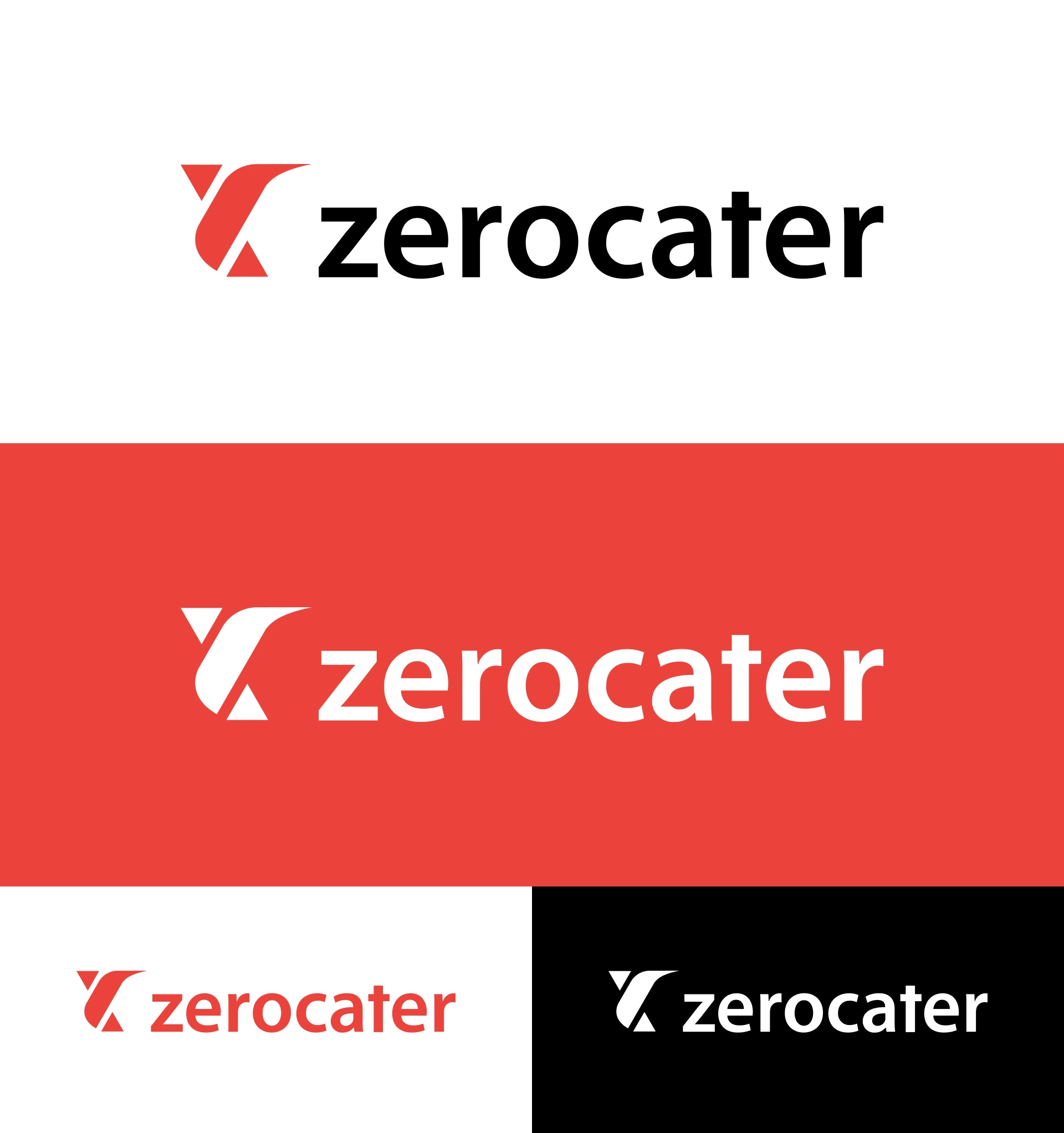
The original Zerocater identity was inspired by origami. The idea was that catering should feel effortless to the customer even though delivering that experience requires considerable operational complexity, precision and attention to detail behind the scenes. In the 2022 redesign, Zerocater deliberately retained this origami DNA but radically simplified the symbol.
“C” = Cater / Catering
Visually, the dominant white negative-space form can be interpreted as a stylized C, immediately connecting the symbol to the company's core catering business. This “C” interpretation is a visual analysis rather than a meaning explicitly stated by Zerocater.
Origami bird = Effortless simplicity
The geometry retains the spirit of the company's original origami crane/bird. Zerocater says this represents making catering feel simple and effortless for customers.
Up + down forms = Feedback and technology
This is explicitly intentional. Zerocater says the up/down arrows reference its technology, where users rate meals and that feedback helps the company intelligently curate future experiences.
Geometric construction = Flexibility
The symbol is made from a small number of bold geometric forms that can visually suggest movement, modularity and customization—all relevant to Zerocater's flexible food programs.
So for your DigiBrandX case study, I would articulate the logo concept as:
A simplified geometric “C” inspired by Zerocater's origami heritage, expressing effortless catering, flexibility, customization and technology-driven feedback.
Making workplace food effortlessly better.
Zerocater describes its purpose as helping companies build better workplaces through food. Its current proposition combines catering, managed cafeterias and technology to create personalized workplace dining experiences.
The philosophy can be structured around four principles:
Simplicity — Complex food operations should feel seamless to the customer.
Personalization — Food experiences should respond to employee preferences rather than follow a one-size-fits-all model.
Connection — Food isn't positioned simply as a commodity; it contributes to workplace culture, employee experience and connection.
Technology + human experience — Technology, data and feedback operate behind the scenes so the visible customer experience remains straightforward. Zerocater describes its approach as combining culinary expertise, technology, data and analytics to personalize workplace dining.
Zerocater transforms the complexity of workplace food into a simple, personalized and connected experience—using technology, culinary expertise and human insight to help companies build better workplaces.
The design philosophy is particularly clear because Zerocater identified Realignment, Simplicity and Focus as the three drivers behind its refreshed identity.
The visual system removes unnecessary detail. The logo is reduced to essential geometric shapes, reflecting the same principle as the service: complex operations behind the scenes, effortless experience in front.
Rather than abandoning the original identity, the redesign preserved its origami heritage. This gives the brand continuity while making the mark more contemporary, scalable and digitally appropriate.
The geometric components can function as more than a static logo. Their shapes can become graphic devices, directional elements and visual patterns across digital interfaces, presentations, packaging and communications.
The lowercase zerocater wordmark feels less corporate and more approachable. Zerocater specifically says it simplified the wordmark and moved to lowercase to make the identity more inclusive for its diverse customer community.
One of the redesign principles was to shift communication from explaining how the technology works toward showing what the products do for customers.
DigiBrandX is a branding agency, creative agency, and logo design agency helping startups build distinctive brands from strategy to execution. We create the right solutions by combining research, positioning, identity design, visual communication, and creative direction to develop a consistent and memorable brand system.
For businesses operating in corporate dining, workplace services, and experience-led sectors, branding must connect with people across every interaction. We consider the complete employee experience and design meaningful brand touchpoints that strengthen recognition and consistency. From logos and typography to digital communication, signage, and environmental branding, every element works together as part of a unified brand experience.
Whether you are launching a startup, repositioning an existing business, or entering a competitive market, DigiBrandX transforms strategic thinking into relevant creative solutions designed to help your brand communicate clearly, differentiate confidently, and build lasting connections with its audience.
DigiBrandX transforms brand strategy into distinctive visual identities and meaningful brand experiences. From positioning and identity design to creative communication and digital touchpoints, we develop cohesive brand systems that strengthen recognition, consistency, and audience connection. Our strategic and design-led approach helps businesses create relevant, scalable identities that communicate clearly and support long-term brand growth.
Planning Your Project?