Good design is not simply about making something visually attractive. It is about helping people understand information quickly, recognize relationships between elements, and navigate visual experiences intuitively. Gestalt principles provide designers with a psychological framework for understanding how people naturally organize and interpret what they see.
Originating from Gestalt psychology, these principles explain how the human mind tends to perceive individual visual elements as organized groups, patterns, and complete forms. For designers, this understanding is valuable across graphic design, logo design, brand identity, visual communication, UI design, and UX design.
Whether someone is viewing a logo, website interface, mobile application, advertisement, or packaging system, Gestalt principles can influence what they notice first, which elements they associate with one another, and how easily they understand the overall composition.
Understanding these principles therefore helps designers make more deliberate decisions rather than relying on aesthetics alone.
Gestalt principles of design are based on theories of visual perception that describe how people naturally organize visual information.
The German word Gestalt roughly refers to a form, pattern, configuration, or unified whole. One of the central ideas behind Gestalt psychology is that people often perceive an overall structure before consciously processing every individual component within it.
For example, when several shapes are positioned close together, we may automatically perceive them as belonging to one group. When part of a familiar shape is missing, our mind may mentally complete it. When foreground and background interact cleverly, we may discover multiple meanings within the same composition.
These perceptual tendencies form the foundation of many Gestalt design principles used by designers today.
Design constantly asks the viewer to interpret relationships.
Which information belongs together? What should attract attention first? Which element is interactive? Where should the eye move next? What is foreground and what is background?
Gestalt principles help designers answer these questions through visual organization.
When applied appropriately, they can improve:
Gestalt theory is therefore not simply an academic concept. It provides a practical framework for understanding visual perception in design.
Although Gestalt theory contains several related concepts, the following principles are particularly relevant to contemporary visual, branding and digital design.
The Gestalt principle of proximity states that objects positioned close to one another tend to be perceived as belonging to the same group.
Imagine six icons arranged in two groups of three. Even if all six icons have exactly the same appearance, the spacing between them can make viewers perceive two separate groups.
This principle is particularly important in digital interfaces.
A heading positioned close to a paragraph is naturally interpreted as belonging to that paragraph. A label positioned beside an input field is understood as describing that field.
Effective spacing therefore communicates relationships without requiring additional lines, borders or decorative elements.
The principle of similarity explains how people tend to associate elements that share characteristics such as colour, shape, size, typography or visual treatment.
For example, if all clickable buttons on a website share a consistent appearance, users quickly learn that visually similar elements perform similar functions.
Similarity is also important in brand identity. Consistent typography, colours, imagery and graphic elements allow different communications to feel like parts of the same visual system.
The Gestalt principle of closure describes our tendency to mentally complete incomplete visual forms.
A designer does not necessarily need to draw every boundary of an object for viewers to recognize it. When enough visual information is available, the mind can often fill in the missing parts.
Closure can be especially powerful in logo design, where simplified or incomplete forms can create memorable visual ideas.
However, simplicity must remain balanced with recognition. Removing too much information can turn an intelligent visual idea into an ambiguous one.
The principle of continuity, sometimes called good continuation, suggests that the eye naturally follows lines, curves and visual paths.
Designers can use this behaviour to guide attention through a composition.
On a website, alignment between headings, images, text and interface components can establish a natural reading direction. In advertising and graphic communication, lines, shapes, photography or directional elements can lead the viewer toward important information.
Continuity therefore helps create visual flow rather than leaving individual elements feeling disconnected.
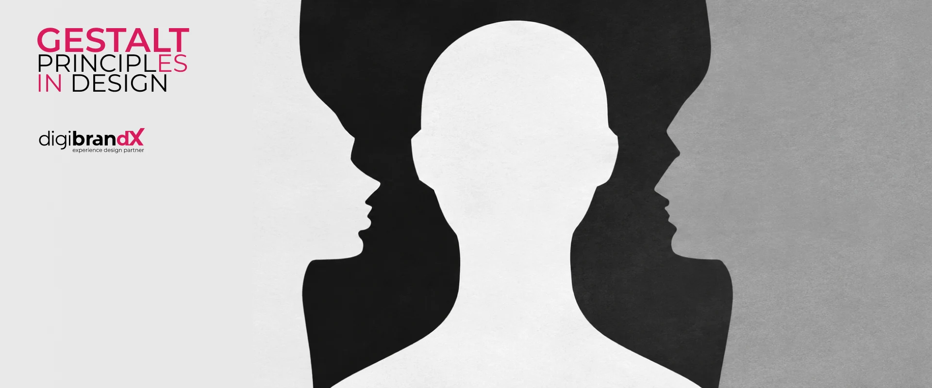
The figure-ground principle describes how people distinguish an object of attention—the figure—from the surrounding area or background.
Strong figure-ground relationships help viewers immediately identify what deserves attention.
This concept is especially important in typography, interface design, advertising and logo design. Contrast between foreground and background can improve clarity, while carefully designed negative space can sometimes create an additional visual meaning.
The relationship between positive and negative space is therefore an important component of effective visual communication.
Elements moving or appearing to move in the same direction tend to be perceived as belonging together. This is known as the principle of common fate.
The principle has become particularly relevant in digital experiences involving animation, interaction and motion design.
For example, interface elements that move together during a transition can communicate that they belong to the same functional group. Motion therefore becomes more than decoration—it can help explain relationships and changes within an interface.
The law of Prägnanz, sometimes described as the principle of simplicity or good form, suggests that people tend to interpret complex visual information in the simplest stable form available.
This does not mean that every design must be minimal.
Rather, it suggests that strong visual communication usually benefits from recognizable structure, hierarchy and order.
This principle is particularly relevant to brand symbols, icons and interfaces, where people often have only a short amount of time to recognize and understand what they are seeing.
Gestalt principles in logo design can help transform individual shapes, spaces and forms into a unified visual idea.
A successful logo needs to operate as more than decoration. It should create recognition while remaining functional across different sizes, applications and communication environments.
Closure allows designers to suggest a recognizable symbol without completely drawing it.
An incomplete circle, letterform or geometric shape may still be perceived as complete because the viewer mentally fills in the missing visual information.
This technique can create a more distinctive logo while reducing unnecessary visual complexity.
The figure-ground principle in logo design can create relationships between positive forms and negative space.
Negative space does not have to be empty or accidental. When deliberately designed, it can become an active part of the visual concept.
This can allow one logo to communicate more than one idea without adding unnecessary graphical elements.
A logo may contain multiple shapes but still be perceived as a single symbol because of proximity or similarity.
Repeated shapes, consistent visual characteristics and controlled spacing can establish unity between individual components.
These principles become particularly useful when designing modular symbols or identities composed of multiple graphic elements.
Prägnanz helps explain why many effective symbols can be reduced to relatively simple, recognizable structures.
The objective, however, should not be simplicity merely for the sake of minimalism. A strong logo design should balance simplicity with distinctiveness, relevance and strategic meaning.
This is where perceptual psychology and brand strategy can work together.
The same principles become extremely practical in UI/UX design.
Proximity can group related controls. Similarity can establish consistent interaction patterns. Figure-ground relationships can distinguish primary content from supporting information. Continuity can guide users through a page, while common fate can make interface transitions easier to understand.
Product information may form one visual group, payment details another, and the final action a clearly differentiated element. Users do not consciously analyze every spacing decision; instead, the visual structure helps them understand the interface.
This demonstrates an important principle of user-centred design: good interfaces reduce unnecessary cognitive effort.
Gestalt theory can therefore help designers create interfaces that feel intuitive because their visual organization corresponds with natural perceptual behaviour.
Gestalt principles also extend beyond individual logos into complete brand identity systems.
A brand may use a consistent combination of typography, colour, shapes, photography, iconography and layout principles across websites, packaging, presentations, advertisements and social media.
Similarity helps audiences recognize these communications as belonging to the same organization.
Proximity establishes relationships between information. Figure-ground creates emphasis. Continuity can establish recognizable layouts and graphic behaviour.
This is why effective visual identity is not simply a collection of attractive assets. It is a coordinated visual system.
Gestalt principles should be treated as perceptual tools rather than rigid formulas.
One common mistake is overusing similarity until everything receives equal visual importance. Another is using proximity without enough spacing to distinguish separate information groups.
Designers may also become overly dependent on negative-space tricks in logo design, creating concepts that are clever but difficult to recognize.
In UI design, inconsistent similarity can be particularly problematic. If two buttons look identical but behave differently, the visual system can create incorrect expectations.
The objective should always be clarity before cleverness.
At DigiBrandX, design is approached as a combination of strategy, communication, visual thinking and user experience rather than aesthetics in isolation.
Drawing on decades of experience across branding and creative disciplines, our approach considers how audiences perceive, recognize and interact with visual information when developing logos, brand identity systems and digital experiences.
Gestalt principles can provide one useful framework within that broader design process. Principles such as closure, proximity, similarity and figure-ground can help designers make deliberate decisions about composition and visual relationships.
The final objective is not simply to apply a design principle, but to create communication that is distinctive, understandable, relevant and consistent with the brand's strategic purpose.
Understanding Gestalt principles gives designers a valuable way to think about how audiences perceive visual information.
Proximity establishes relationships. Similarity creates patterns. Closure allows the mind to complete forms. Continuity directs attention. Figure-ground establishes focus, and Prägnanz encourages understandable visual structure.
The real value of Gestalt theory is not in mechanically applying individual rules. It lies in understanding how visual decisions influence perception.
Whether developing a logo, building a brand identity or designing a digital interface, that understanding can help transform separate visual elements into a coherent and meaningful experience.
Kishore Pratim Biswas is the Founder, Managing Director and Creative Director of DigiBrandX, with over 30 years of experience in branding, creative strategy and visual communication. His expertise spans brand strategy, brand identity, logo design, advertising, UI/UX and digital experiences across diverse industries. Having contributed to more than 250 brands, Kishore combines strategic thinking with design principles, visual perception and user-centred approaches to create distinctive brand experiences that connect business objectives with audience needs.
Planning Your Project?