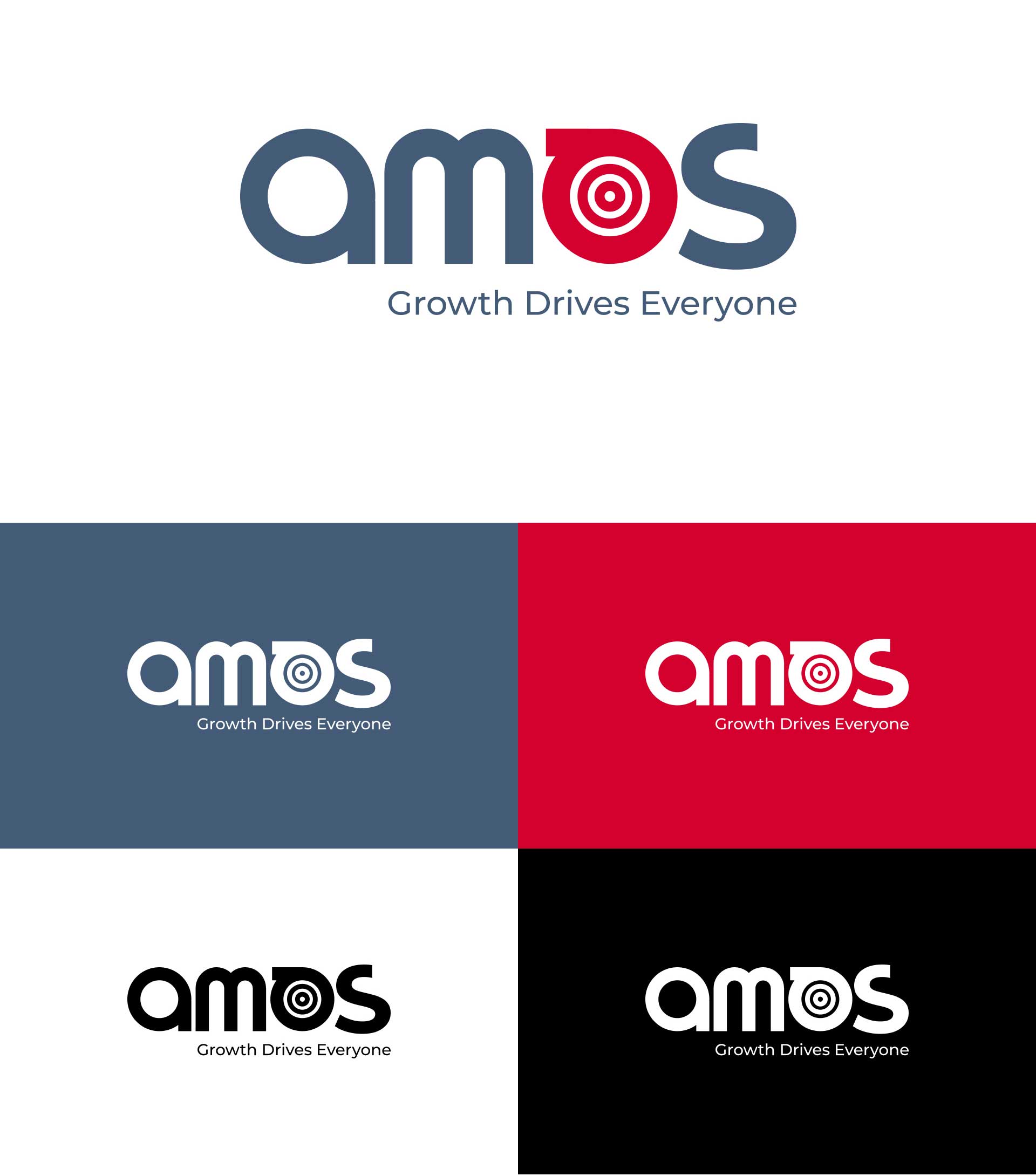
The Amos logo draws inspiration from the raw strength and transformative process of steel-making. The font color reflects the natural tone of raw steel material, grounding the brand in authenticity and industry grit. At the heart of the design, the letter “O” is stylized as a distinct emblem, symbolizing the brand's core.
Within this emblematic “O,” lies the true essence—a glowing red hot coil, representing the molten stage of steel during formation. This circular form reflects the rolling process of shaping hot iron into steel sheets, capturing a moment of intense heat, precision, and craftsmanship. The vibrant red inside the “O” evokes the power and energy of transformation, giving the brand a bold and dynamic visual identity.

Planning Your Project?